Dramatic Design
by AJ
"The campus library has become an intellectual gathering place. Think of Europe's philosophical cafes where writers and thinkers met to exchange ideas rather than the wan and lonely graduate student holed up in a study carrel. As Mr. Natriello likes to say, the library is ''moving from being a warehouse to a workshop.''
That shift in purpose has precipitated sweeping design changes that are showing up in academic libraries across the country, say architects, librarians and educators involved in their construction and renovation. Individual carrels are giving way to group study rooms, often constructed of glass to decrease a sense of isolation; ''No Food Permitted'' signs have been superceded by cybercafes and vending machines; media labs and instruction rooms have been added; cushy chairs and couches are arranged around coffee tables; stacks are open; various services are laid out like sweets on a dessert tray."
--Jim Trelease
Trelease nails down an important phenomenon Ive noticed: generally, people like bookstores & cafes better than libraries. Im an avid reader. I love getting new books. I should go to San Francisco's large central library. But I never seem to. Instead, I gravitate to Borders Books and City Lights Bookstore.
When I walk into the library, I feel a sinking feeling. It feels drab. And, as Trelease mentions, its unfriendly to browsing. Almost all the books are shelved spine-out, rather than cover out.
Its the opposite with the bookstores. I feel an uplift as soon as I walk in. The decor is warm and inviting.. seems to say, "stay awhile and look around". Chairs are placed all over.. making it easy to thumb through a book. many books are shelved cover-out. There are "employee recommendation" sections... interesting books shelved cover-out, with insightful reviews by the staff. Borders has a coffee shop inside... they ENCOURAGE customers to have a seat, chill out, and skim books.

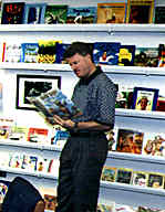
Why not incorporate the bookstore's successful strategies. Look at the above picture.. its from Jim Trelease's site. It shows how a teacher transformed his class into a mini-library & workshop. This is cheap and easy to do. Notice how stimulating this environment looks. The layout practically begs students to wander around and browse.
Now add plenty of comfortable chairs. Some artwork. A mini-cafe corner. Natural lighting. Suddenly you have a space that INVITES students... a place their brains are attracted to... a place they want to spend time in. This is a space that invites "self-study"... free reading, free listening. Add a TV & DVD player. Put some DVD titles on the shelves, cover-out. Sprinkle computers throughout... perhaps create colorful mini-posters that recommend excellent English learning sites. Add a microwave, coffee maker, fridge. Nice instrumental music playing softly.
Our schools typically resemble public libraries... while stocked with plenty of resources, they are.. in a word.. ugly. Brain-antagonistic. At an emotional level, they repel students (no wonder they race out of class so quickly). But with a little attention to design, these resources can be presented in a more inviting & beautiful way... a way that is brain-friendly.. that attracts students at an emotional level.
And teachers too!
San Francisco, CA
"The campus library has become an intellectual gathering place. Think of Europe's philosophical cafes where writers and thinkers met to exchange ideas rather than the wan and lonely graduate student holed up in a study carrel. As Mr. Natriello likes to say, the library is ''moving from being a warehouse to a workshop.''
That shift in purpose has precipitated sweeping design changes that are showing up in academic libraries across the country, say architects, librarians and educators involved in their construction and renovation. Individual carrels are giving way to group study rooms, often constructed of glass to decrease a sense of isolation; ''No Food Permitted'' signs have been superceded by cybercafes and vending machines; media labs and instruction rooms have been added; cushy chairs and couches are arranged around coffee tables; stacks are open; various services are laid out like sweets on a dessert tray."
--Jim Trelease
Trelease nails down an important phenomenon Ive noticed: generally, people like bookstores & cafes better than libraries. Im an avid reader. I love getting new books. I should go to San Francisco's large central library. But I never seem to. Instead, I gravitate to Borders Books and City Lights Bookstore.
When I walk into the library, I feel a sinking feeling. It feels drab. And, as Trelease mentions, its unfriendly to browsing. Almost all the books are shelved spine-out, rather than cover out.
Its the opposite with the bookstores. I feel an uplift as soon as I walk in. The decor is warm and inviting.. seems to say, "stay awhile and look around". Chairs are placed all over.. making it easy to thumb through a book. many books are shelved cover-out. There are "employee recommendation" sections... interesting books shelved cover-out, with insightful reviews by the staff. Borders has a coffee shop inside... they ENCOURAGE customers to have a seat, chill out, and skim books.

Why not incorporate the bookstore's successful strategies. Look at the above picture.. its from Jim Trelease's site. It shows how a teacher transformed his class into a mini-library & workshop. This is cheap and easy to do. Notice how stimulating this environment looks. The layout practically begs students to wander around and browse.
Now add plenty of comfortable chairs. Some artwork. A mini-cafe corner. Natural lighting. Suddenly you have a space that INVITES students... a place their brains are attracted to... a place they want to spend time in. This is a space that invites "self-study"... free reading, free listening. Add a TV & DVD player. Put some DVD titles on the shelves, cover-out. Sprinkle computers throughout... perhaps create colorful mini-posters that recommend excellent English learning sites. Add a microwave, coffee maker, fridge. Nice instrumental music playing softly.
Our schools typically resemble public libraries... while stocked with plenty of resources, they are.. in a word.. ugly. Brain-antagonistic. At an emotional level, they repel students (no wonder they race out of class so quickly). But with a little attention to design, these resources can be presented in a more inviting & beautiful way... a way that is brain-friendly.. that attracts students at an emotional level.
And teachers too!
San Francisco, CA


<< Home